Swipe Watch
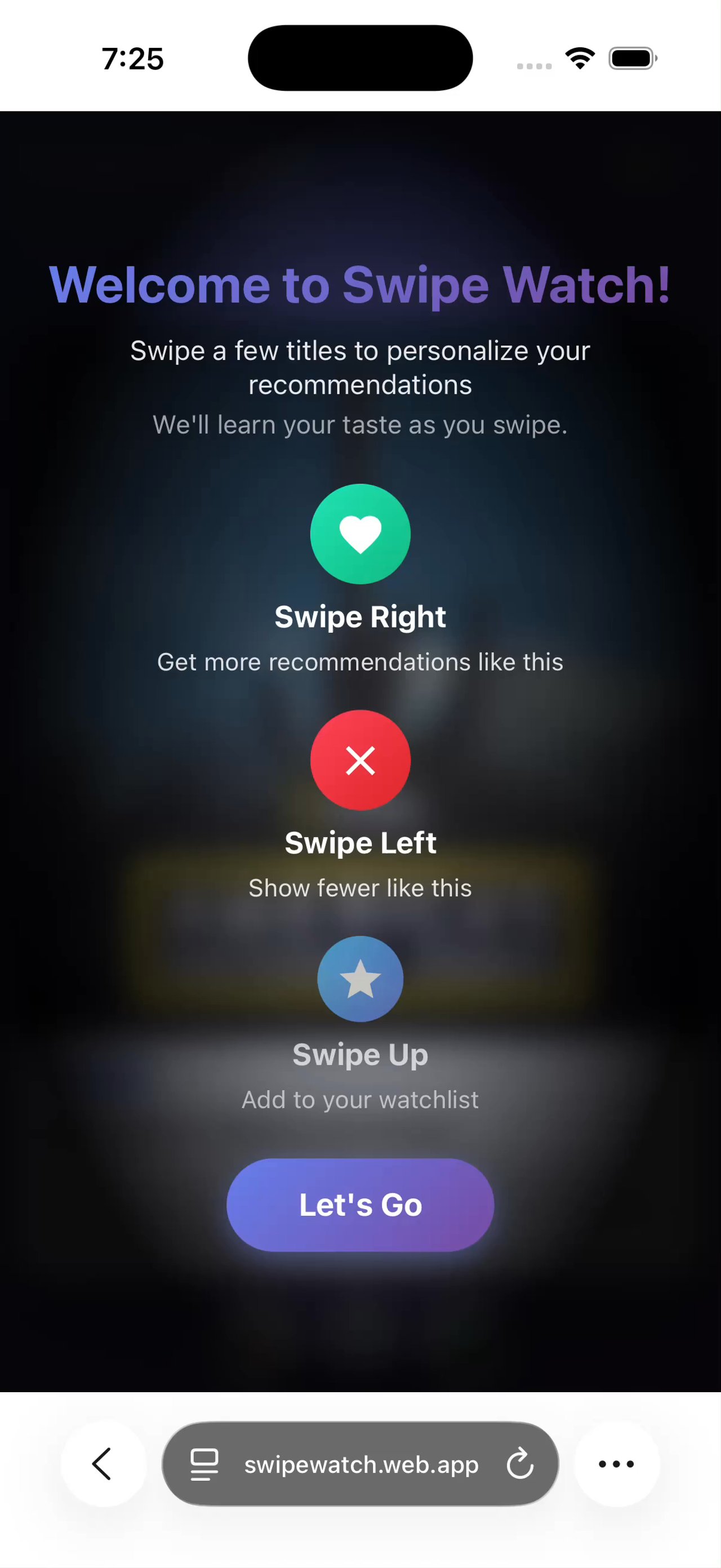
I built an independent swipe prototype with Disney+ and Hulu titles to ask for taste before a viewer presses play. It simulates the recommendation payoff; no engine learns from it.
The hypothesis
I wanted to test a cheaper way to ask about taste. Starting, finishing or abandoning a title costs a viewer attention. A recommender that waits for those signals has to wait for that commitment too.
My hypothesis was that discovery could gather preferences before viewing. If the system learns only when someone presses play, a viewer can browse for ten minutes without teaching it anything.
A swipe costs a gesture. I wanted an interface that asked for taste directly, instead of inferring it from what someone finished last month. The question was whether discovery itself could gather the preferences a recommender needed.
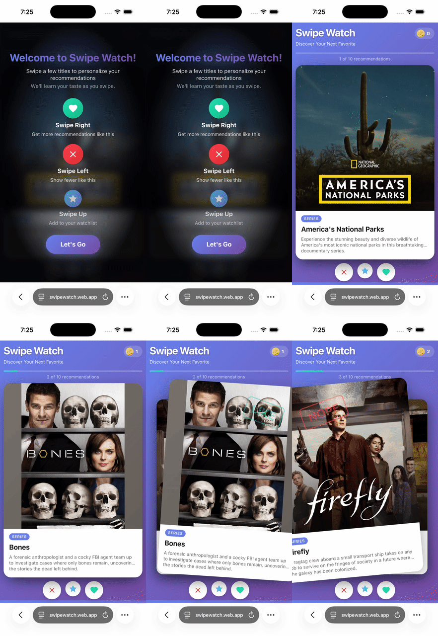
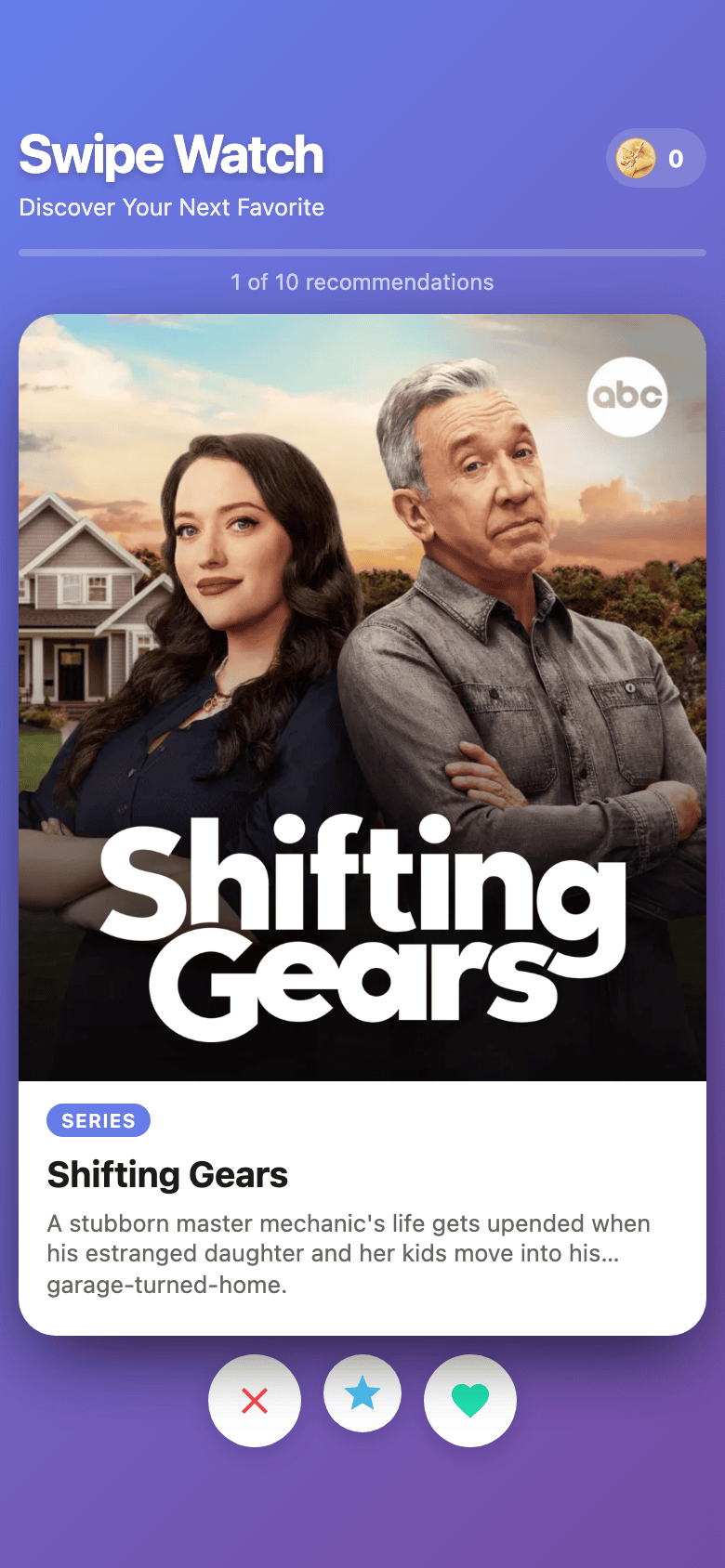
I built Swipe Watch with real Disney+ and Hulu titles and key art, dealt as cards. Swipe left to dismiss, right for interested, up to flag one for later. Each gesture gives a low-stakes signal before a viewer commits to watching.
- 13 commitscore build in the repository record; work predates the first commit
- 106 titleshand-curated
- 10 cardsper session
- No backenddevice-local
The prototype
I built the first version around one question: does swiping feel natural for expressing taste in a streaming catalog? I needed real titles, real art and card physics to test that. I did not need a recommendation engine, so I left it out.
Then I ran out of cards. Sessions deal ten, and the first version ended at a dead-end screen. A preference-gathering loop that terminates after ten signals is not a loop.
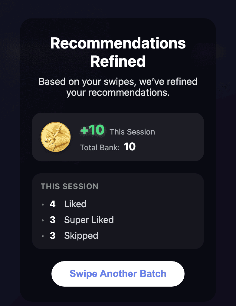
In the second iteration, I added coins: earn them by swiping, then spend them to unlock further discovery modes. I wanted the end of a deck to offer a reason to keep going.
That change came from watching the core mechanic run out of room. It also added another untested mechanic to an experiment that had started with one question.
- FidelityValidated
No stack until the feel earns one
- What I encountered
- I wanted to know whether swiping felt natural for expressing taste in a streaming catalog. I could have started with React, a bundler and a build pipeline before moving the first card.
- Over
- A framework scaffold, like the larger applications in this portfolio use. I would usually choose one for something meant to outlive a prototype.
- What I decided
- I used vanilla JavaScript, with no framework or build step. Firebase Hosting serves the source files as-is. It served the repo root until 2026-09-29 and a static public/ directory since. There is no build output.
- Why
- I was testing the feel of the interaction. Anything between an edit and a reload got in the way. The repository records thirteen core-build commits, but the first already contains a working prototype. That count does not measure all the work I would have discarded if the swipe felt wrong.
- Cost
- I kept the throwaway. Types, components and a build step are still missing. Taking it into a product would mean a rewrite rather than an extension.
- What it changed
- I never had to unwind that choice. The first commit already carried a working swipe UI, session management and analytics. The prototype still has no build script or runtime dependency.
- InterpretabilityMixed
Let the prototype fake its payoff
- What I encountered
- The proposed loop was swipe, then get better recommendations. I left its second half out of scope: no ML and no personalization. If the prototype said nothing after a swipe, it would show a different, deader product.
- Over
- A plain session summary, without a promise of better recommendations. That would make reactions easier to interpret, but leave the missing half visible in the demo.
- What I decided
- I let the copy simulate the missing payoff. The demo could show the loop I was proposing even though the software implemented only part of it.
- Why
- People seeing the prototype would have to imagine the finished version either way. I wanted to give them something concrete to react to.
- Cost
- I made reactions to the demo impossible to separate from reactions to the idea. People could respond to a recommendation payoff the software did not produce. No demo of this prototype can tell me whether the real loop works.
- What it changed
- I describe the demo conversation in What I learned below. The simulated payoff let me show the proposed loop, but could not validate it.
- LoopPending
Give the deck a bottom
- What I encountered
- The first build let me work through ten cards, then stopped at a dead-end screen. It gave me one round of preference gathering and a restart button.
- Over
- Keep the prototype to one question and leave the economy out. That would avoid adding another untested mechanic and give me a longer coin-free baseline.
- What I decided
- I added an economy. Swipes earn coins, and coins unlock further discovery modes. Finishing the deck could give a viewer a reason to keep going.
- Why
- One coin per swipe makes an unlock cost exactly 25 swipes. That was easy to understand and cheap to build on the counters already there.
- Cost
- I compromised the baseline for the swipe by adding a second mechanic. A coin-free production window exists: a few days to a month, depending on when the first deploy landed. No analysis of it has been published. The prototype cannot tell me whether the swipe alone sustains attention.
- Validation boundary
- I set up no flag, variant or cohort to compare engagement before and after the economy. The question remains unresolved. An unlock opens another view of the same catalog; it does not add titles.
What I learned
My argument was signal density, not “Tinder for streaming.”
Ten cards can produce ten explicit preference statements before a viewer commits to watching. In a hypothetical session with no more than one play, a recommender that learns only from plays would get at most one signal. If no title is played, it gets none. My hypothesis was that asking for a cheap signal could gather more preferences for the same attention.
I wanted to feed a recommender explicit, deliberately given preferences while a viewer was already deciding what to watch. It could work with dense, explicit answers collected before viewing, instead of waiting to infer taste from sparse, expensive, ambiguous events.
I demoed Swipe Watch to Disney’s EVP of Product, and the signal-density argument is what landed. The prototype made an abstract argument concrete enough to react to. That is my account of a conversation, not a measurement. It tells me the question is worth asking. It does not tell me the answer is yes.
No result from the prototype’s analytics has been published. The save gesture has a limit too: the app counts it as Super Liked for the session, then forgets when the session ends. It does not keep a saved-title list.
My read is that the interaction holds up: the gesture is legible, the deck is quick, and the loop has somewhere to go. Whether those signals beat viewing history is still unanswered. The prototype observes no viewing history to compare against.
Swipe Watch is not a recommendation engine. It is the interaction layer I would put upstream of one.