The HTML Mock-up Is the Spec: How I Got Visual Work Out of Claude Code
Claude kept giving me layouts that didn't match what I had in mind. I asked it for standalone HTML mock-ups, picked a target, then handed it back beside the live page: make this look like that. I still had to keep the decision and check what shipped.
Key takeaways
- Give the agent a small example in the same medium as its output: an HTML file it can diff, a CLI transcript, a JSON response, an approved paragraph. A screenshot asks it to do art criticism.
- A mock-up holds the design steady only while it exists and stays the target. Write the decision into the issue and attach the file.
- Check the shipped page for accessibility, responsive behavior, real content, interactions, and performance. Matching the mock-up doesn't cover those checks.
- Prototype outside the production build. Claude can work on the layout first, then deal with the real page's schema, tests, and routing.
I’m a product manager, not an engineer. In the first weeks of building nathanpayne.com with Claude Code, I knew what I wanted the site to look like. The homepage was already a Mondrian grid. I wanted the rest of the site to look like it belonged there. I thought “more Mondrian, less LinkedIn” was clear enough. The pages coming back said otherwise.
What helped was giving Claude something concrete to work from. I asked it to build a standalone HTML mock-up first. Once I’d approved that, I handed it back with the existing page: make this look like that. I used versions of this approach on four surfaces across two codebases; for one, the reference was a public demo rather than a mock-up Claude built. Descriptions, diagrams, and annotated screenshots had all fallen short; the HTML files gave me something I could compare. Keeping the decision was a separate problem. Most of my local mock-ups are gone. The issue threads preserve what I chose, what I changed, and the files that survived.
What I tried first
I started by pointing Claude at the existing page and describing the change. “Make the blog index more Mondrian. Red, blue, yellow, black. Asymmetric grid. Featured post gets the largest cell.” What came back looked more like a Bootstrap card list with a red border than a De Stijl composition. Asking for “more Mondrian” again didn’t help. Pointing at the homepage mostly got me a copy of the homepage.
Then I tried diagrams. I sketched the grid in a notebook, photographed it, and pasted it into the chat. Claude described it accurately, down to which cell spanned two columns, then wrote code that didn’t match its own description.
Annotated screenshots came next: arrows, red boxes, notes giving a width and a color. Claude treated them as a list of changes to make. I got the red box where the arrow pointed, with the rest of the layout largely untouched.
These weren’t controlled comparisons. I tried them in sequence, changing prompts, context, my idea of the target, and the number of iterations along the way. Four surfaces where a change of artifact coincided with the work landing make a case series, not a measured property of coding agents. In these cases, asking Claude to read and match an HTML file worked where asking it to interpret a description hadn’t.
The blog index: choosing a target, then replacing it
For issue #75, the Mondrian redesign of the blog index, I asked Claude to build several candidate HTML mock-ups. Each got its own file, one inline style block, and a Google Fonts link. There was no Astro, no Content Collections, and no build pipeline. I could open them in a browser at desktop and mobile widths.
As best I can reconstruct it, I wanted three things: a file Claude could read, alternatives cheap enough to explore, and a design I could compare with the finished page. Asking “does the page match” would give me something more useful to work on than another request for more Mondrian.
Claude produced four files—A-cards-grid.html, B-de-stijl-index.html, C-composition-margins.html, D-minimal.html—and I picked Mockup B. It put the featured post in the top-left cell, a red accent block in the top middle, and a blue block with a vertical “LATEST” label on the right. Yellow and a neutral RSS block sat farther down. On mobile, it collapsed to a single column. Each candidate was small: one representative example of each kind of content, the site’s fonts and color tokens, and the first real post as sample content. Four candidates cost less than one production page.
I wrote the chosen design’s key characteristics into issue #75. The issue has them as bullets; condensed to prose:
Mockup B from
mockups/B-de-stijl-index.html. Key characteristics: featured post in the largest cell (top-left), spanning multiple rows—echoes the red panel on the homepage. Accent blocks: red (top-mid), blue with vertical “Latest” label (top-right, spanning rows), yellow (bottom-right). Older posts fill progressively smaller cells. RSS CTA: neutral block with subscribe link. 9px black grid lines between all cells.
That recorded what I’d chosen, including the 9px grid lines a reader can still check on the live page. But I changed the target before I shipped it.
Partway through the day, I posted a screenshot of a row-based mock-up as “the source of truth.” Two rounds of fixes followed, the second from a twenty-item comparison. I then wrote “Still not right. Let’s try another approach. Build exactly like this HTML mockup.” and attached blog-landing 2.html. It had one post per row, one real post, and two placeholders. I asked Claude to read the mock-up alongside src/pages/blog/index.astro and make the live page look like it. The fresh plan an hour later named that file as its source of truth. PR #77 opened thirteen minutes after the plan.
This was a deliberate replacement of Mockup B. Issue #75’s design section names mockups/B-de-stijl-index.html; PR #77’s body never mentions it. The only mock-up the PR names is blog-landing 2.html, a different design. The shipped grid never had B’s spanning featured cell. It followed the row-based file I’d attached, which also survives in the thread.
PR #77 replaced the card list with a Mondrian-style row grid. Its title, which became the squash-commit subject, was “Blog index: De Stijl Mondrian row grid from mockup.”
The post template
I used the same approach for the post template in PR #76. Issue #74 recorded my choice of Mockup C:
Mockup C from
mockups/C-composition-margins.html. Key characteristics:
That became the three-column canvas you’re reading: an accent margin on the left, the article in the middle, and a sidebar on the right. PR #82 removed the sidebar’s sticky positioning the same day. The sidebar now scrolls with the page, and the metadata becomes a horizontal accent bar on narrow screens.
It felt fast once there was a file to build against. Issues #74 and #75 both opened and closed within a single day; PRs #76 and #77 were open for between fifteen minutes and half an hour before merging. Those are administrative intervals. They don’t measure the design effort, and neither the mock-up iterations nor the earlier prose attempts left a timed trace. Once I had a file to match, the implementation landed essentially at once. The earlier attempts hadn’t gotten me there.
The 404 page
For the 404 page, I used an existing public reference: Jen Simmons’ Mondrian Art in CSS Grid series. It had self-contained examples of the asymmetric composition I wanted. Claude didn’t have to generate the reference for it to be useful; it had to be able to read it.
The comment in src/styles/global.css credits Simmons’ CodePen. That pen has since been deleted, but the examples remain in her layout lab:
/* ── 404 Page: Mondrian Grid ────
   Asymmetric grid inspired by Jen Simmons' Mondrian CSS Grid CodePen.
   Content cell spans multiple tracks; decorative blocks fill remaining cells.
   Collapses to single column on mobile with blocks hidden. ── */
This one is less flattering: the page landed through issue #90, an SEO best-practices task, in commit 4076bf6. It was a single-parent commit pushed directly to main, closing #90. There was no pull request. My companion piece covers making direct pushes to main mechanically expensive. The FFB example below records the same failure. FFB issue #145 documents the after-the-fact review.
Two pull requests refined the 404 page. PR #91 removed the Firebase rewrite that sent every 404 to the SPA shell. Until that change, the new page wasn’t reachable as a real 404 page. PR #92 then brought its colors into line with the homepage palette.
The FFB template editor
Friends & Family Billing (FFB) is the app I built to handle utility splits in my household. Its invoicing tab lets a user write the email template sent with each invoice. It needed a full visual overhaul, and describing the changes got me the same wrong tweaks I’d seen on the blog index.
I asked Claude for a standalone HTML mock-up of the editor. The target was a single card holding the subject row, a unified token chip bar, the formatting toolbar, the body editor, and a sticky save footer. Pill-shaped Edit/Preview tabs sat above it. It was static HTML and CSS, without TipTap, React, or token logic.
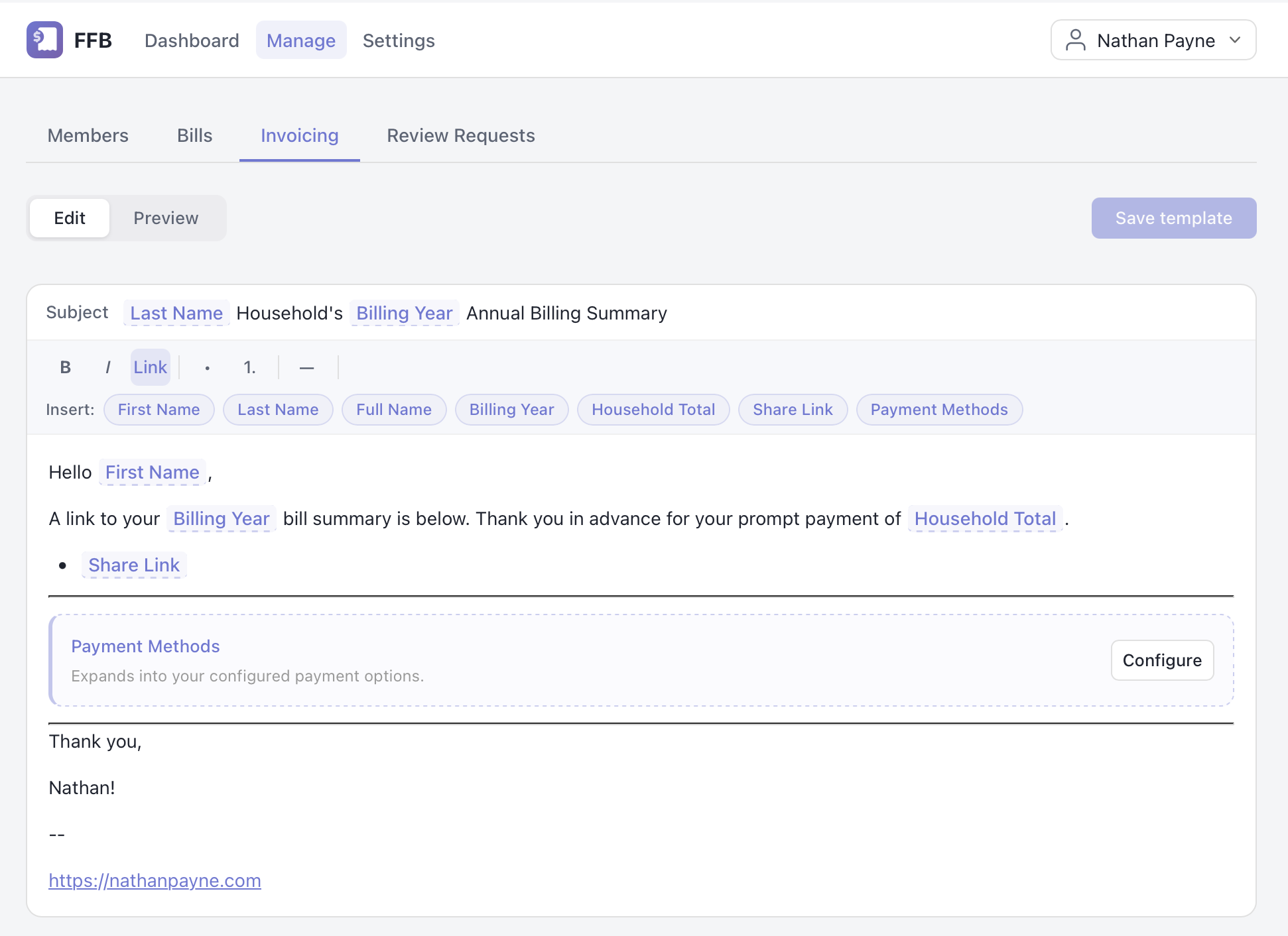
This screenshot shows the shipped editor after a later change. The mock-up had the save control in a sticky footer; the fix for FFB issue #176 moved it into the header three days later. The mock-up itself didn’t survive.
I handed Claude the mock-up and the live InvoicingTab.jsx with its stylesheets. The work landed in commit 20dcb32, titled “fix: redesign editor layout to match mockup and fix editability.”
The agent pushed it directly to main without a PR. Issue #145 logged it as a policy violation and requested external review.
The authoring agent’s handoff began “Restructures the InvoicingTab editor to match the target mockup,” then listed the single-card layout, unified chip bar, sticky save footer with its “Last saved” timestamp, and redesigned Preview tab with a footer-positioned send button. Those decisions had been made in the mock-up. The external reviewer, who hadn’t seen my prompts, reported two bugs in the token-migration path and said nothing about the layout. The claim that the layout matched comes from the authoring agent’s own handoff; no independent review records a layout check. A reviewer naming the target unprompted would have been a better test, and I don’t have one.
This was more complicated than the static blog and 404 layouts. The rich-text editor used TipTap, token nodes, and migration logic. The mock-up let me decide the layout separately from those concerns. The layout work stayed clean while an architectural problem remained in the same file: the markdown bridge that took a session of six pull requests and a reframed brief to remove, described in Six PRs, One Bug. Specifying the appearance helped with the layout. The system’s behavior still needed an invariant.
What shipped
| Surface | Input artifact | Selection and acceptance | Record | Quality bar | Outcome | What a reader can inspect |
|---|---|---|---|---|---|---|
| Blog index | blog-landing 2.html—the row-grid mock-up that replaced Mockup B mid-issue; never committed, attached to issue #75 | I picked B of four candidates, replaced it with the row-grid target recorded in the thread, and accepted the PR | Issue #75 → PR #77, whose body names blog-landing 2.html | Match blog-landing 2.html; a passing build and manual visual checks (no CI test gate existed until 2026-08-19) | Shipped and still matching that file’s row geometry: one post per row, the 9px rules, row two’s post column 72% wide against row one’s 50% on the live /blog/, though the accent colors have since changed. It never matched Mockup B’s spanning featured cell | Issue #75’s transcription and thread, with the attached file; PR #77’s body; the live blog index |
| Post template | Mockup C—agent-generated local HTML, never committed, attached to issue #74 with a screenshot | I picked C and accepted the PR | Issue #74 → PR #76 | Match Mockup C; the same build-and-eyeball bar | Shipped; it renders the page you are reading, minus the sticky sidebar PR #82 removed the same day | Issue #74’s transcription, file and screenshot; the layout of this page |
| 404 page | Jen Simmons’ Mondrian grid demos—public, still live in her layout lab; the CodePen is gone | I chose the reference | Issue #90 → commit 4076bf6, direct to main, no PR; refined in PR #91 and PR #92 | Visual target first; refinements followed | Shipped, but not reachable until #91 removed the Firebase rewrite, and the palette took one further PR, #92 | The lab demos; the CSS comment; both refinement PRs |
| FFB editor | Agent-built HTML mock-up, not preserved; the screenshot above is the shipped page | I accepted the mock-up as the target | Commit 20dcb32; policy review in FFB issue #145 | Match the mock-up and fix editability | Shipped with matching the mock-up as the stated target; the external reviewer found two migration bugs and did not comment on the layout—and the commit bypassed review to get there | The shipped page; #145’s handoff summary and external review |
Claude generated the candidates and wrote the implementations. I chose the targets, transcribed the decisions into the issues, and accepted the results. The mock-ups made those design decisions easier to make and check. They didn’t enforce the shipping process: two of the four surfaces reached main through direct pushes.
Why the HTML helped
Three things changed together when I started handing Claude HTML files, and I can’t separate their contributions.
Pasting an annotated screenshot is asking the agent to do art criticism. Pasting an HTML file is asking it to do diffs. Claude had HTML and CSS it could read and compare with the live page.
The prototype ran outside the production build. It didn’t have a schema to satisfy, tests to pass, or routes to preserve. Claude could work on the design first and re-implement it within the production constraints afterward. When I pointed it straight at the live page, it had to solve both problems at once. The constraints it could verify kept winning over the design intent it couldn’t.
I had to choose, too. Opening a file in a browser and approving it gave me a target. I could ask “why doesn’t this match” instead of continuing to ask “what do I want this to look like.” That was a question I could answer with a diff.
What the issues kept
The first version of this post went further: “Specs that live in prose drift with every prompt. Specs that live in HTML do not.” I retract that claim. It depended on the agent being able to re-read the file instead of remembering the conversation. An HTML file can hold a design steady while it exists and remains the target. My working copies were deleted or replaced.
None of the four candidate files was committed. There’s no mockups/ directory in the repository’s history and no commit adding any of them. They lived on my disk while the decision was open. Mockup C is still attached to issue #74, with a screenshot, and opens today. B is corroborated by name only in issue #75. A-cards-grid.html and D-minimal.html appear in no surviving record. You have my memory that they existed, and nothing else. The replacement row-grid file survives on its issue too.
Deleting a local file removes that copy from later prompts, regression checks, and comparisons with the page a year on. Replacing the target leaves the old file specifying a page that was never built. The attached copies are evidence of what I decided. They weren’t handed back to the agent as a continuing spec.
The blog index still follows the row geometry I chose, though its accent colors have since changed. Issue #75 kept both the original transcription and the replacement file, so a reader can follow the decision. The mock-up was useful while I was choosing the design and Claude was implementing it. The issue preserved the choice after the local file was gone.
What I now check before accepting a page
At the time, I treated a side-by-side comparison as the whole acceptance test: “that is the only acceptance criterion that matters: do they match.” Resemblance was a useful design check. It wasn’t enough to decide whether the page was ready to ship.
Today, the required workflow runs npm test, npm run lint, and, since 2026-09-12, the browser-driven Playwright responsive suite. They include a test that renders Mermaid diagrams and fails the build on WCAG AA contrast violations, CSS assertions for responsive behavior, and SEO plumbing validated at build time. A page could match pixel for pixel and still fail those checks.
The responsive suite wasn’t always required. npm run test:e2e was deliberately manual and absent from CI, so a responsive regression could pass every blocking gate. #1022 made it a required step. Those later gates weren’t the bar the original blog-layout PRs shipped under; that was a passing build and manual visual checks, as the table records.
I also need to check real content, interactions, and performance. The mock-ups had one featured post and a couple of placeholders. They didn’t show what a full archive would do to the layout.
The hero image on this post is a 3.1 MB JPEG. It matched the visual intent, and a “do they match” check wouldn’t flag its weight. The post arguing that visual acceptance and production acceptance are different bars is itself sitting on the wrong side of one.
The process needs its own checks too. Mergepath exists to close gaps like those direct pushes. Branch protection now requires a pull request from every identity short of the repository administrator. The record shows that exemption still in use as late as 2026-08-28.
How I use the approach now
The workflow has four steps:
- Ask for two or three different HTML mock-ups. Keep them self-contained, with inline styles and no build dependencies, so they open by double-click.
- Open them at desktop and mobile widths. Pick one, or ask for variants of the closest candidate.
- Write the chosen design’s key characteristics into the issue and attach the file. The local mock-up won’t preserve the decision on its own.
- Hand the agent the mock-up, the issue, and the live page. Compare the implementation with the target, then check the responsive, accessibility, content, interaction, and performance requirements separately.
The lesson isn’t really about HTML: give the agent a small example in the same medium as its output. For a CLI, that could be a transcript of the exact interaction. For an API response, a JSON example carries more than a field list. For tone of voice, an approved paragraph gives it more to work with than adjectives.
I also need to keep what I approved and why, somewhere deleting the working file won’t erase it. This site still uses the layouts specified by Mockup C and the row grid that replaced Mockup B. I deleted those working files, but issues #74 and #75 kept them, along with the decisions that explain what I built.